

Among the colours featured in the book ‘Nature’s Palette’ by Thames and Hudson, there are several that are described as ‘characteristic colours’ as they are used as reference points to describe other colours. As I’m going on a short trip to the UK soon, I thought it would be fun to create a travel palette featuring these key colours (or as close as I can get to them) plus a few others that are featured in the book, so I can test them out when I’m travelling. Read on to find out what I included.

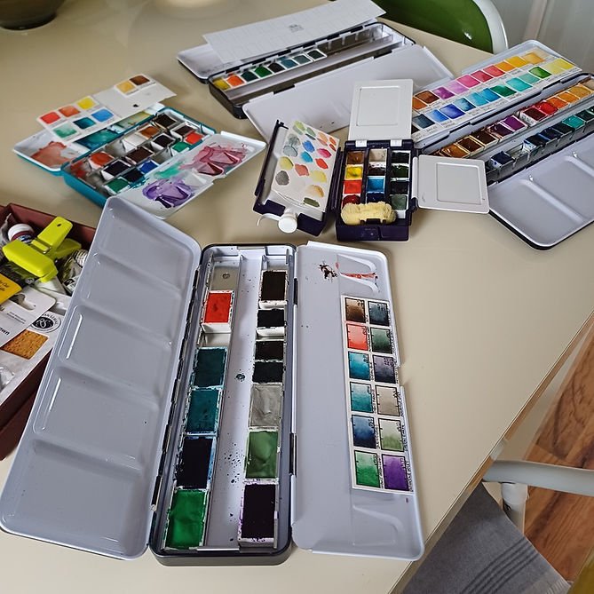
My watercolour palettes have recently got into a right mess as I’ve been swapping colours around with no time to keep track of what I’m doing. With the recent addition of my Winsor and Newton Revival palette, I found I had enough palette space to sort out all my half-pans and put them in collections that I’m more likely to use.
I thought I’d start by using Nature’s Palette as inspiration and creating a travel palette using colours that represent the ‘characteristic colours’ described by Werner and later added to by Syme. If you’d like to read more about this book and how the colour reference guide it contains evolved, then see this blog post, which reviews the book.

I started out by making a list of all the colours that are referred to as being ‘characteristic colours’ and so used as the main reference points for the others colours in the book. I could find 11 that were clearly referred to in this way:
Arterial Blood Red
Carmine Red
Chesnut Brown (that is the spelling in the book as it was the one used by Werner)
Orpiment Orange
Dutch Orange
Lemon Yellow
Emerald Green
Berlin Blue
Velvet Black
Ash Grey
Snow White

I then used the list in the back of the book (which details the Winsor and Newton paint that most closely matches the colour) along with the vegetable, animal and mineral references to the colour that are given within the book, to identify the closest watercolour paint that I had in my collection.

I came up with the following paints as close matches to the ‘characteristic colours’ and added a few more that I thought would match some of the other colours in the book. Although ‘Davy’s Grey’ is on the swatch sheets below (click on the photos to make them larger), I took it out of the final palette and added Schmincke’s ‘Neutral Tint’ as I realised I had several lighter greys and love an interesting shadow colour.


The final palette can be seen below, along with its swatch sheet. I put the half and full pans into my Rosa Gallery palette, which fits 21 half pans and is a lovely turquoise colour.

The following list shows the paints that I included in the palette, along with the characteristic colour that they correspond to from Nature’s Palette. For three of characteristic colours I chose two corresponding colours as I didn’t have an exact match and each were close.
Ivory Black – Velvet Black
Aquarius Grey – Ash Grey
Rügen Chalk – Snow White
Raw Sienna – Orpiment Orange
Madder Lake / Mars Brown – Chesnut Brown
Permanent Alizarin Crimson – Carmine Red
Anthraquinone Scarlet – Arterial Blood Red
Aureolin Hue – Gamboge Yellow
Cadmium Yellow Medium – Lemon Yellow
Cobalt Blue / French Ultramarine – Berlin Blue
Cinnabar Green / Cobalt Green Light – Emerald Green
As I had room and I really wanted to try out a few of my newer colours, I’ve included the following colours too. The closest colour that they correspond to in Nature’s Palette is shown next to them (see round swatches above for all the manufacturer and pigment information):
Mineral Grey – Greyish White
Field’s Orange – Dutch Orange
Ultramarine Ash – Greyish Blue
Neutral Tint – Reddish Black
Leave a Reply