
I’m a sucker for a paint collection, especially if it includes heritage pigments or anything new. I was therefore quick to buy the ‘Revival Collection’ from Winsor and Newton as it contains new versions of heritage colours. Designed so they’re safer to use and with improved permanence, I was very keen to see how they performed. I’ve now had a chance to try these paints out and am sharing my finds in this week’s blog post.
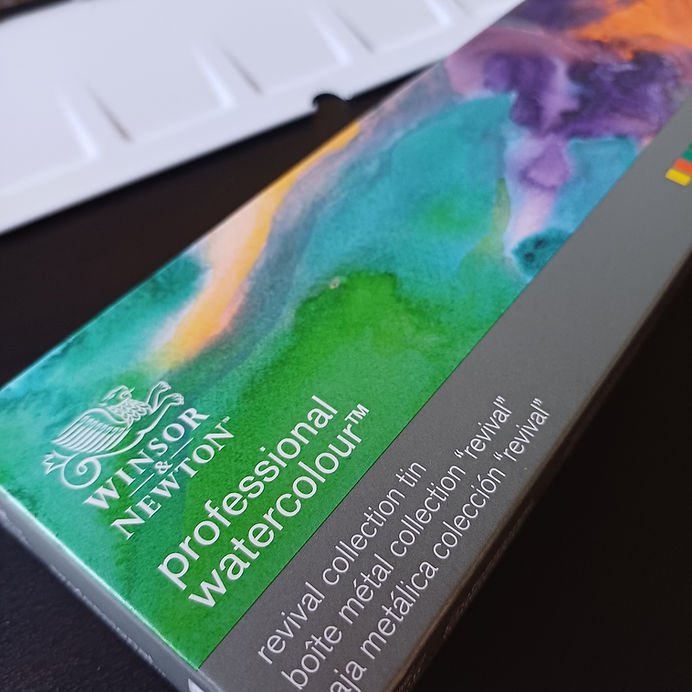
There are 8 colours in the Revival Collection and these are available as individual colours, a set of 6, 5ml tubes or as a half pan set in a tin. I wanted to try all of the colours and needed to buy an extra palette anyway, so opted for the half pan set. The tin is black on the outside, much sturdier than the other similar palettes I own and has the Winsor and Newton branding on the inside and outside of the lid. It also comes with a colour chart to fill in, printed on watercolour paper.

Initially, I just played around with the colours on a sheet of watercolour paper but remembered I had a sheet already printed with the Waffle Flower Color Wheel and Waffle Flower Color Swatches stamp sets. These stamp sets have corresponding die sets to cut them out, if you’d like to, and you can even construct a working colour wheel from the pieces! I used the Versafine Onyx Black ink pad to stamp these sets as this ink captures fine details well and is waterproof when dry.
The colours in the Revival Collection are:
Viridian Hue (PB15:6, PG17, PG7)
Mineral Grey (PB29, PBk19, PW5)
Ostwald Grey (PBk6, PW5, PY42)
There’s a fantastic description of the history of the colours this collection is reproducing on the London Graphic Centre website. Highlights are that Field’s Orange was a colour used extensively by J.M.W. Turner but the recipe was lost when it’s discoverer, George Field, died and has only recently been rediscovered. Also, Ultramarine Ash is a product of the refining process of lapis lazuli. I did a little more research and it seems to be the left-overs after the rich blue pigment has been extracted from lapis lazuli to form Ultramarine Blue.

From the straight swatches of the colours, I found the Aureolin Hue, Field’s Orange, Cinnabar Green and Tyrian Purple to be colours that I’d be unlikely to use on their own, but will probably be very glad of in mixes.
Ultramarine Ash is definitely my favourite colour of the set. It doesn’t have a high tinting strength, but it granulates and is a lovely shade of blue. I’m sure it’ll come in handy for skies and in delicate mixes. It contains PG23 (Terre Verte), which explains the weakness of the colour and should also make it a useful colour for underpainting skin tones.
I really like the greys and the Ostwald Grey is particularly interesting in how it behaves. It seems to have very heavy pigment particles that just kind of dump themselves on the paper. I’m not sure how else to describe it (I’m sure there are better ways). It’s very opaque and a bit of a pain to work with, but I really like it! It is possible to move the particles around and they give a lovely texture. I imagine it’ll be a good colour for stonework in paintings and I loved the result when I added a little of the Tyrian Purple (see photo below).
In the middle ring in the colour wheel above, I added Ostwald Grey to the colours of the outer ring. I quite liked the oranges and the greens with Ostwald Grey, but was not very happy with the colour when yellow was added. The inner ring shows the outer colours mixed with mineral grey.
The Viridian Hue was a nice colour and very close to the original viridian (PG18) that Winsor and Newton used to manufacture. I love PG18 even though it can be a pain to rewet and often leaves little bits on the paper as I use it. The colour of PG18 is soft though, and has it’s own character, which I love. Viridian Hue is certainly easier to work with but has a definite Phthalo character (due to the PB15:3 and PG7) and just isn’t the same. I compared the two side by side in the swatches below. As you can see, the Viridian Hue is harsher and more staining. I’ll treasure my PG18 even more now!
With no strong blue in the set, it was difficult to set up a colour wheel, but I was interested in how some of the colours would mix, especially the Cinnabar Green as I’m least likely to use this on it’s own. I was glad to see that I could easily get some muted greens and rich browns with the Field’s Orange and the Cinnabar Green.

The more I mixed with this set, the more I liked it. The delicate colours produced from the mixes of Ultramarine Ash are so gorgeous, especially the one with the Viridian Hue. I also love the strong Ostwald Grey mixes; the Field’s Orange and Ostwald Grey mix produced a lovely rich brown.

Leave a Reply